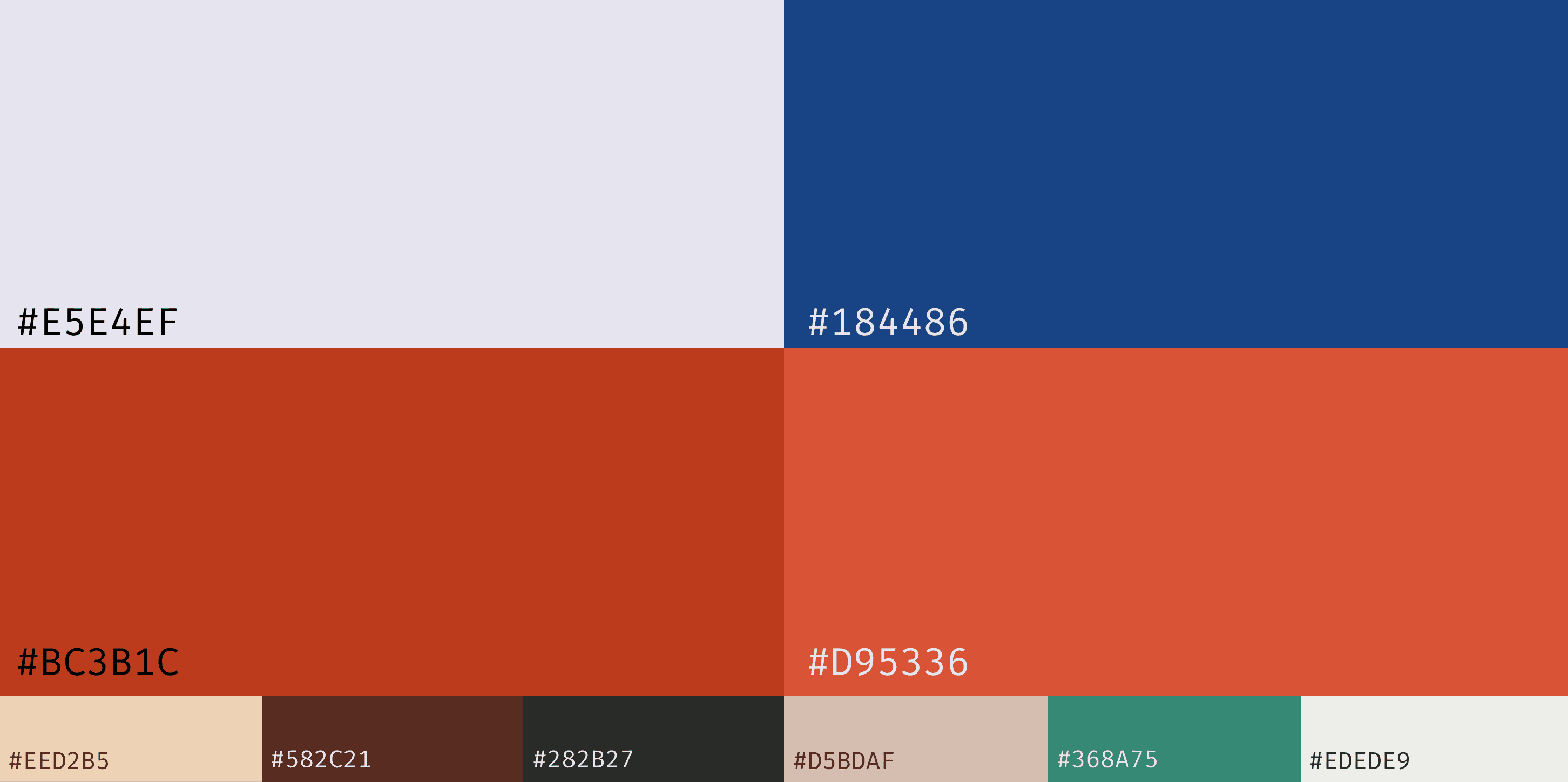
Each Pattern of the Terrai Ikkat has been broken down to allot to the three C’s. Each C is represented through the asigned pattern following a color code.
Nuance
Avante Garde
Re-Imagine
Experimental
Experimental
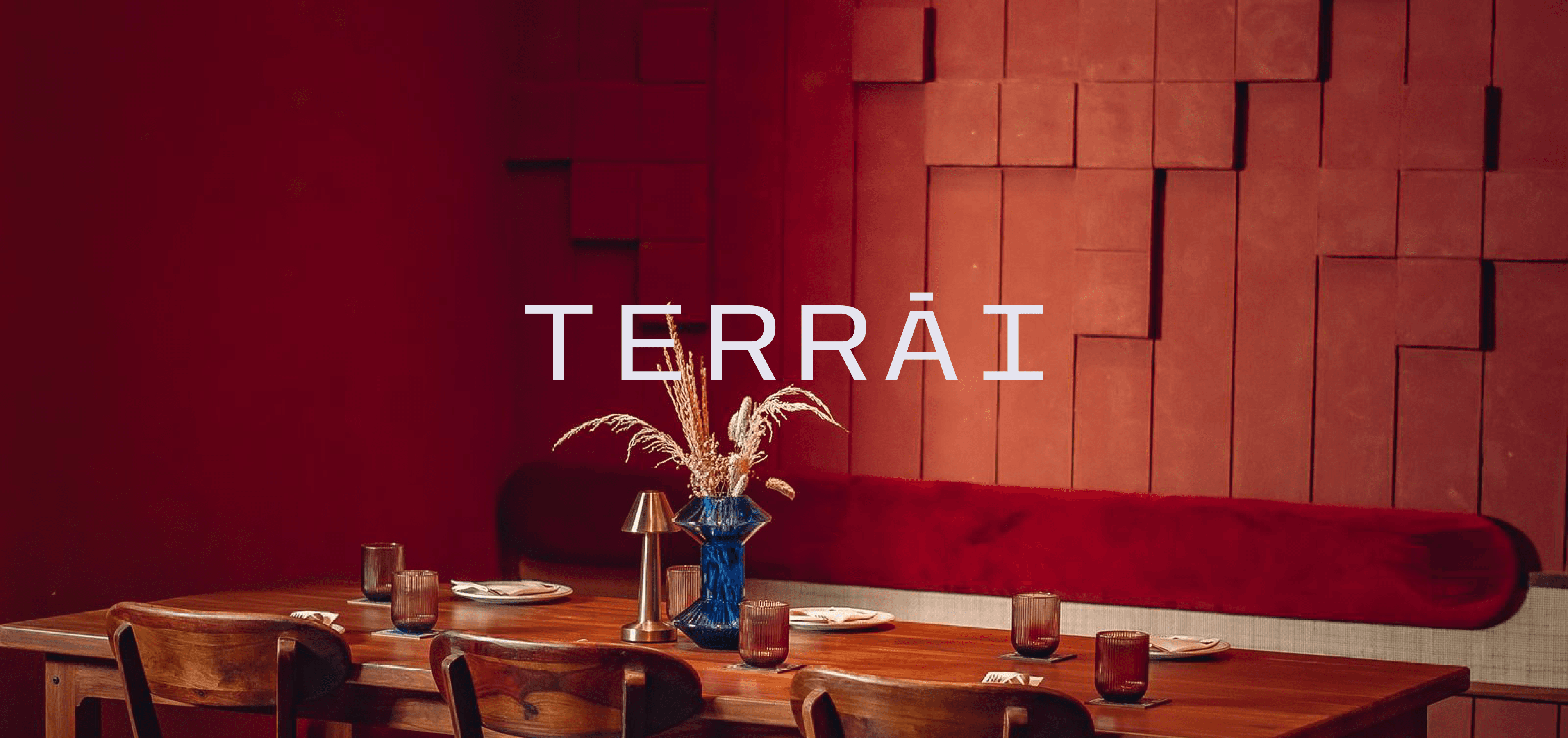
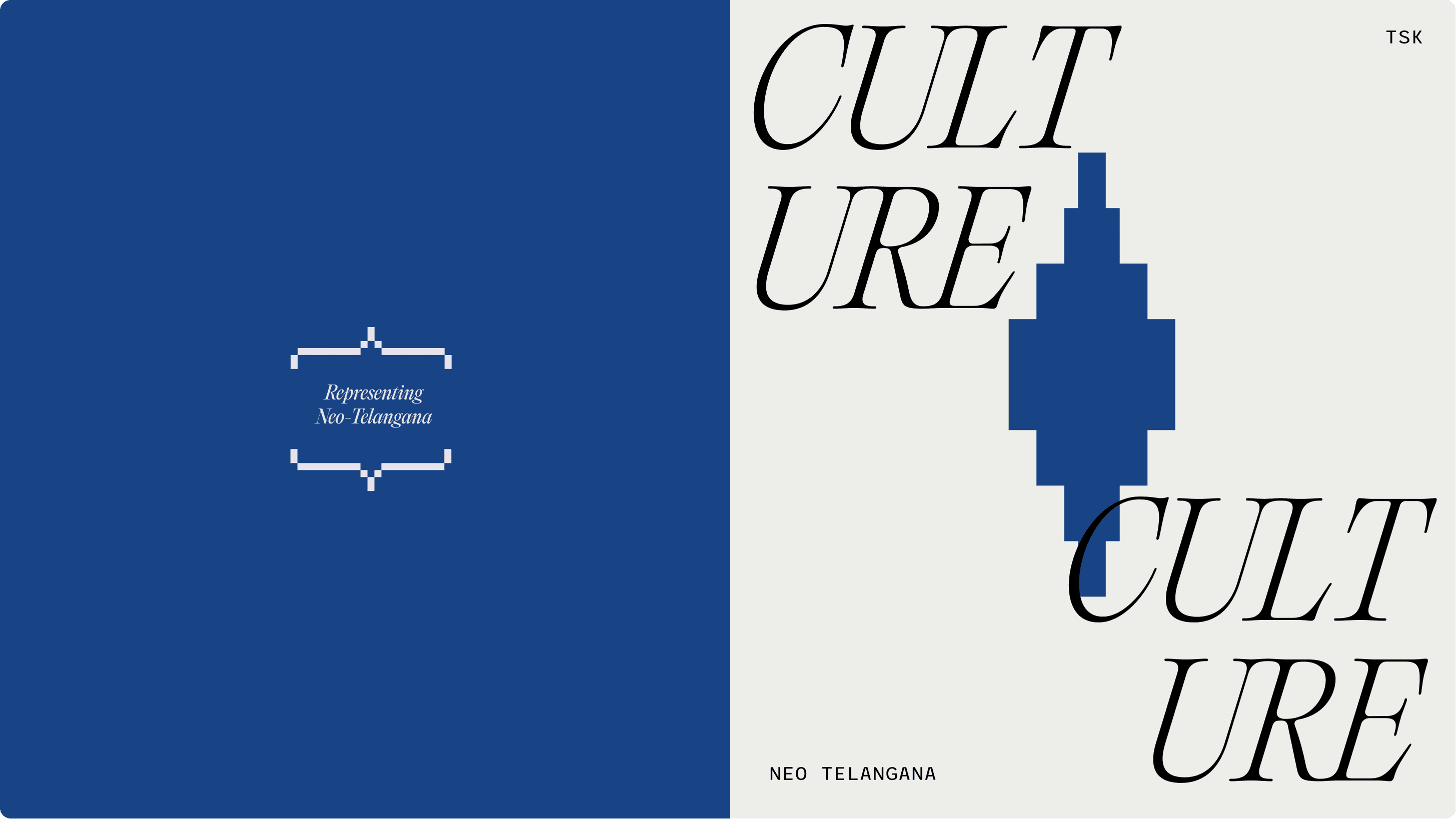
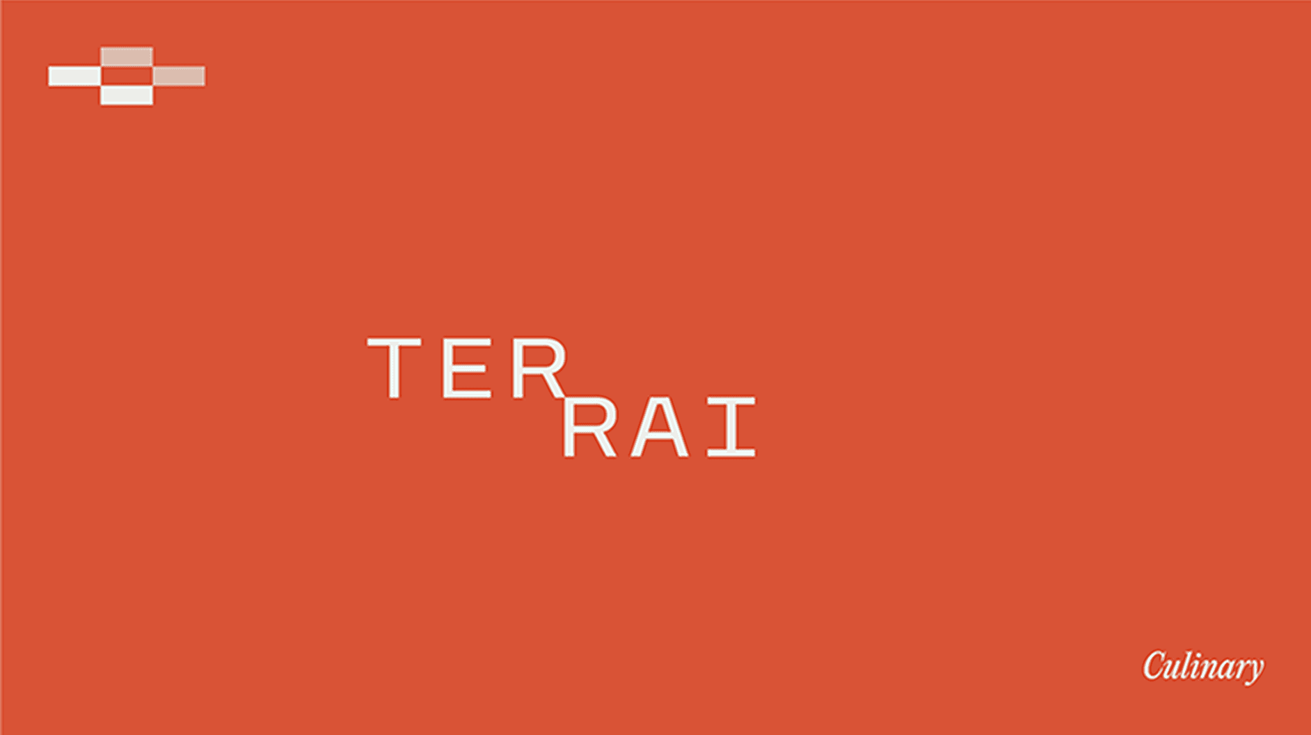
Neo-Telangana Kitchen through avant garde lenses
TEAM: STUDIO318
Art Direction - Rachana Kari
Visual Designer - Miloni Munipally, Priyanka kolluru
Art Direction - Rachana Kari, Priyanka kolluru
Visual Designer - Miloni Munipally, Priyanka kolluru
NAMING
STRATEGY
BRANDING
CREATIVE DIRECTION
ALL RIGHTS RESERVED © 2024 STUDIO318
ALL RIGHTS RESERVED © 2024 STUDIO318
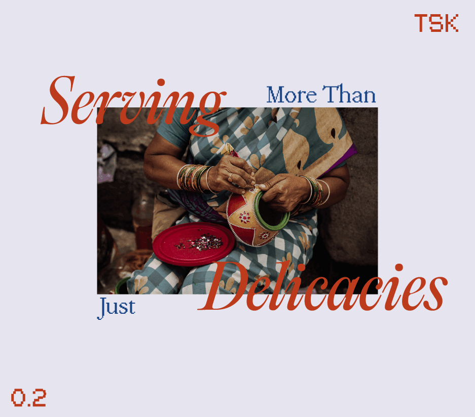
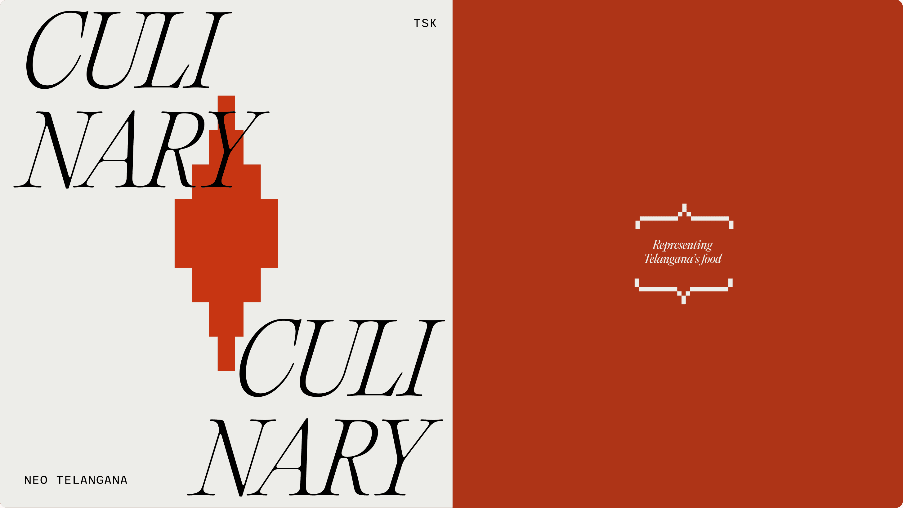
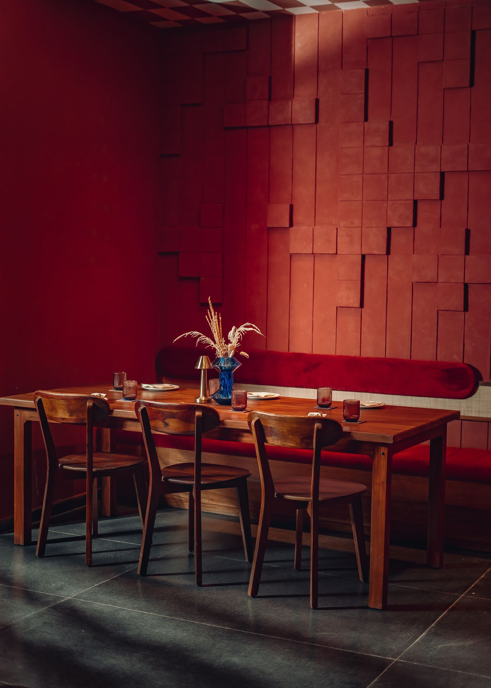
The Founders of Telangana Spice Kitchen; one of the first Telangana restaurant in Hyderabad, came to us with an aim of expanding their business and re-imagining their space. With plenty of South Indian Restaurants in the locality and oversaturation of F&Bs, it was difficult to make an Impact or showcase values of the Restaurant.
We wanted to make sure the Legacy of TSK stands out visually while also meticulously strengthening the brand values. We took a carefully designed Avant-Garde approach that would make customers look at Telangana through an entirely different lense for the first time.
Nuance
Avante Garde
Re-Imagine
Experimental
Re-Imagine
Experimental
Nuance
Avante Garde
Re-Imagine
Experimental
Re-Imagine
Experimental
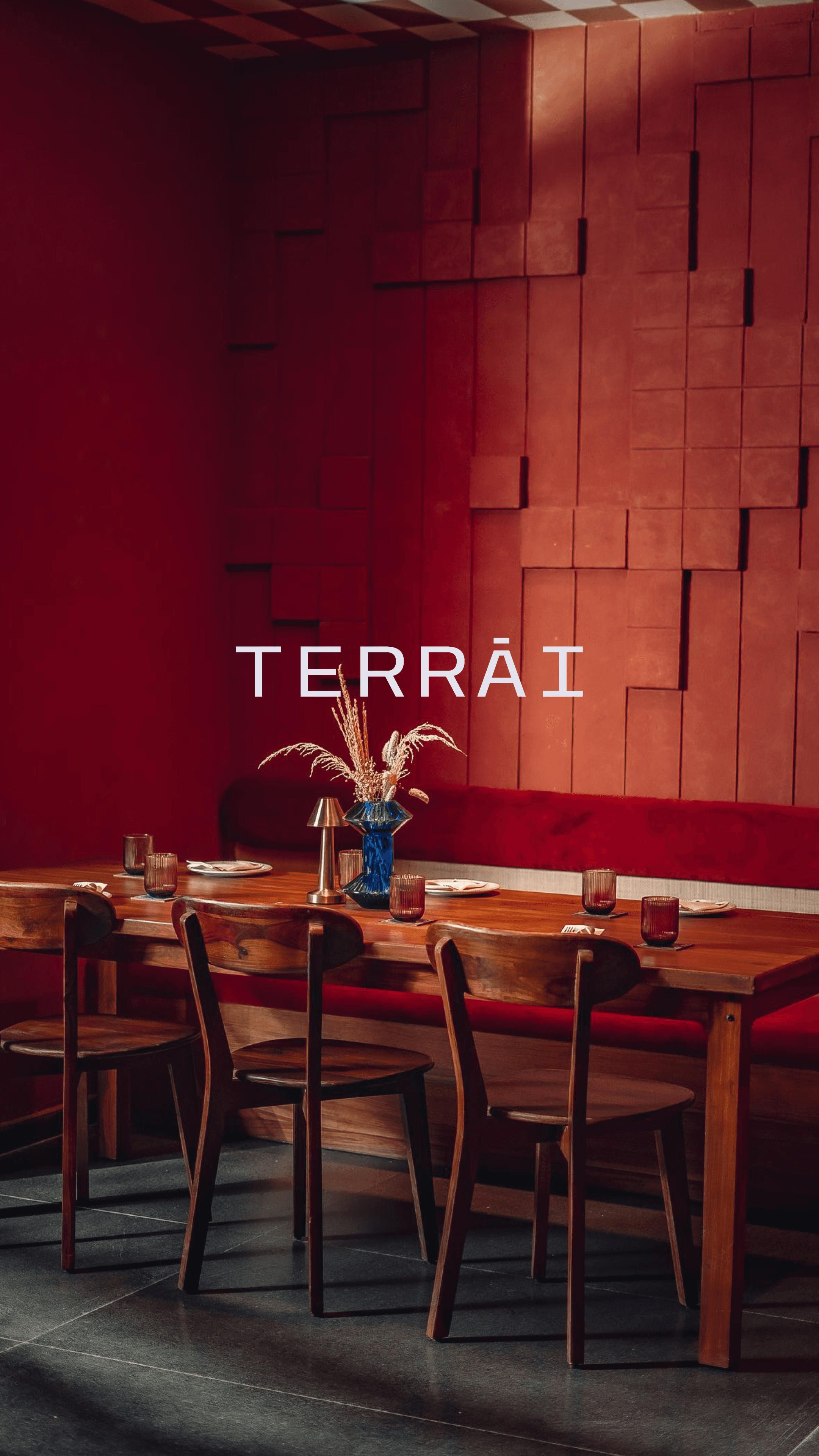
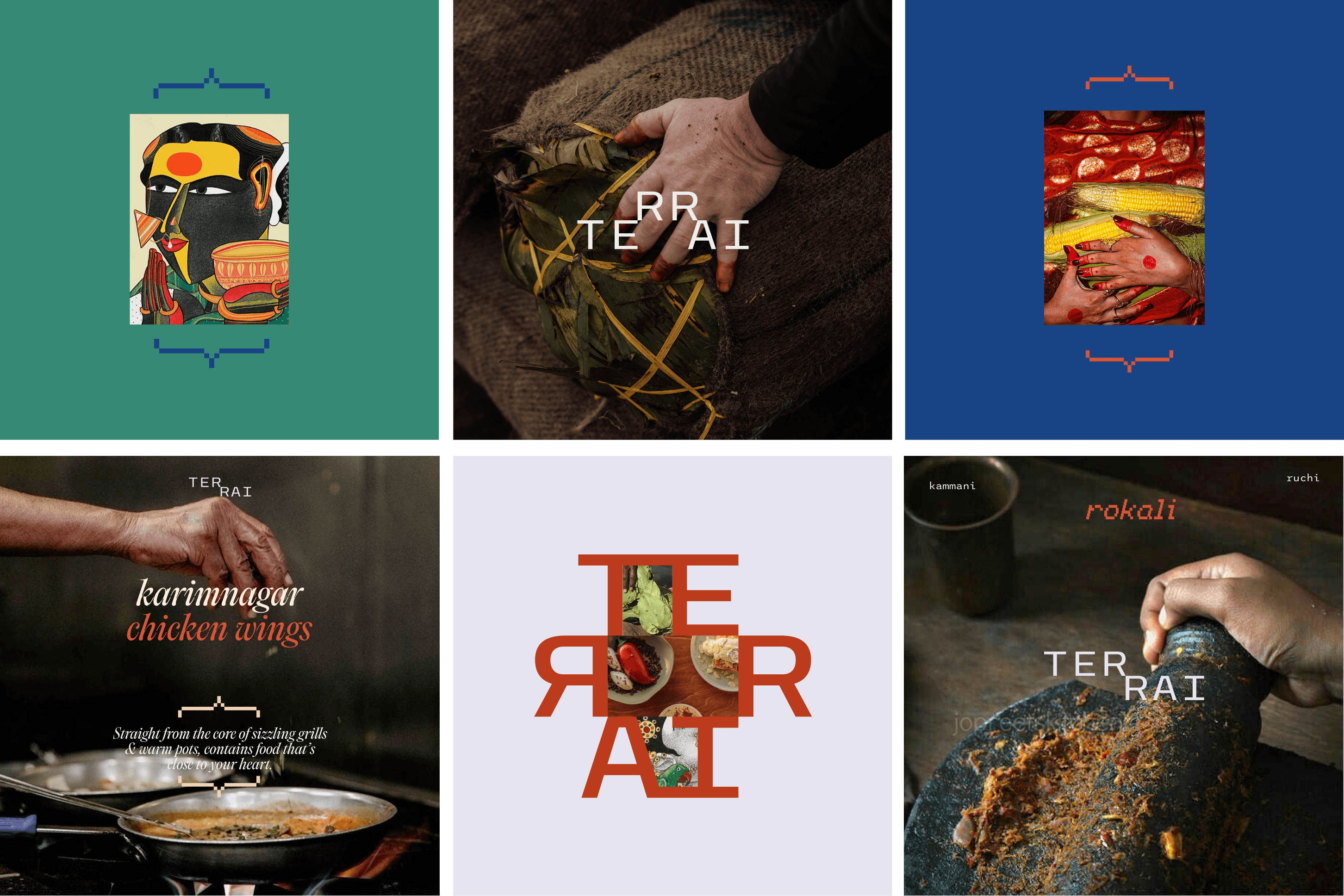
We wanted to elevate the restaurant's experience through an avant-garde approach, reimaginingTelangana through the lenses of Terrai. Rather than idealizing Telangana, our mission was to unveil its inherent essence, showcasing its true identity in all its splendor.
We wanted to elevate the restaurant's experience through an avant-garde approach, reimaginingTelangana through the lenses of Terrai. Rather than idealizing Telangana, our mission was to unveil its inherent essence, showcasing its true identity in all its splendor.
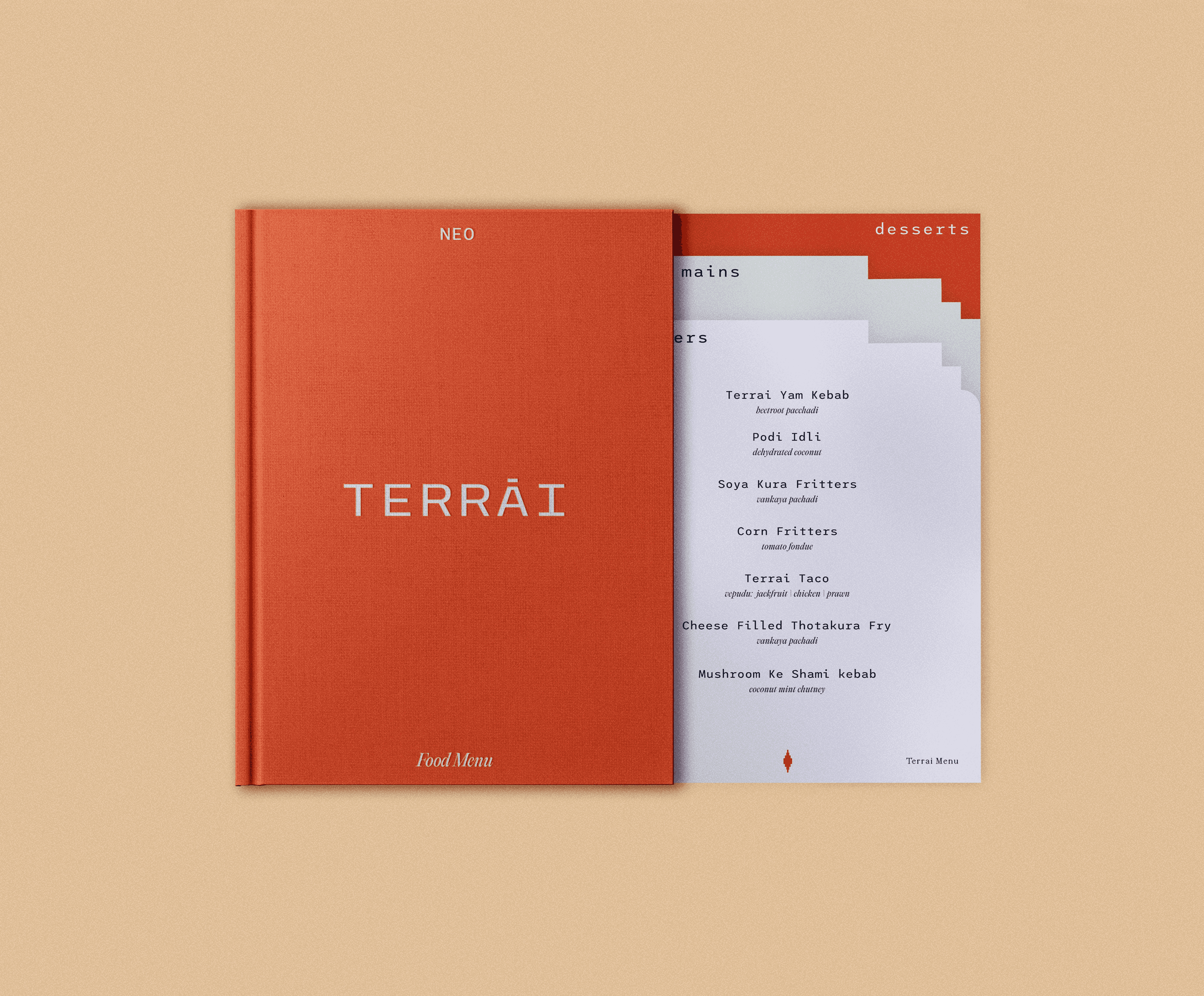
Terrai’s choice of typeface consists of a careful mix of familiarity and unfamiliarity. To showcase the core value of Terrai, we stuck with an old serif while pixel fonts were used contrastingly to depict the nuances.


Terrai’s choice of typeface consists of a careful mix of familiarity and unfamiliarity. To showcase the core value of Terrai, we stuck with an old serif while pixel fonts were used contrastingly to depict the nuances.
Terrai’s choice of typeface consists of a careful mix of familiarity and unfamiliarity. To showcase the core value of Terrai, we stuck with an old serif while pixel fonts were used contrastingly to depict the nuances.
Terrai’s choice of typeface consists of a careful mix of familiarity and unfamiliarity. To showcase the core value of Terrai, we stuck with an old serif while pixel fonts were used contrastingly to depict the nuances.
Terrai’s choice of typeface consists of a careful mix of familiarity and unfamiliarity. To showcase the core value of Terrai, we stuck with an old serif while pixel fonts were used contrastingly to depict the nuances.

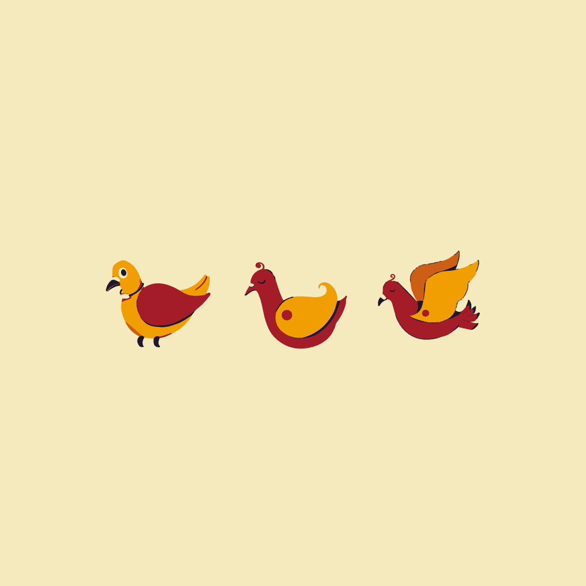
Similarly, we have taken inpiration from the renowned Pochampally Ikat and the commonly seen grooves, pixelating it to bring out the nuances.
Similarly, we have taken inpiration from the renowned Pochampally Ikat and the commonly seen grooves, pixelating it to bring out the nuances.
THE THREE C’s OF TERRAI


BRAND LANGUAGE
SYSTEMS


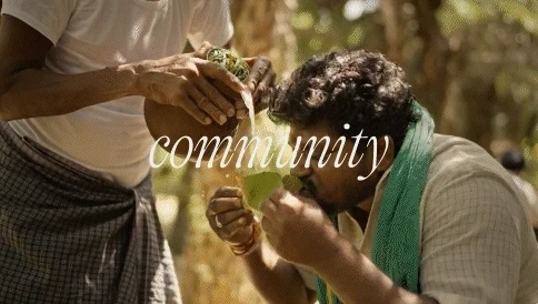
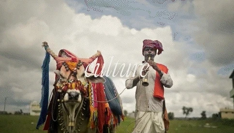


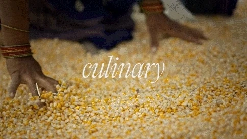
Each Pattern of the Terrai Ikkat has been broken down to allot to the three C’s. Each C is represented through the assigned pattern following a color code.
Each Pattern of the Terrai Ikkat has been broken down to allot to the three C’s. Each C is represented through the assigned pattern following a color code.


Neo-Telangana Kitchen through avant garde Lenses
TEAM: STUDIO318
Art Director: Rachana Kari, Priyanka kolluru
Visual Designer: Miloni Munipally, Priyanka kolluru
NAMING
BRANDING
STRATEGY
ILLUSTRATION
PACKAGING
ALL RIGHTS RESERVED © STUDIO318
NAMING
BRANDING
STRATEGY
CREATIVE DIRECTION
ALL RIGHTS RESERVED © 2024 STUDIO318


Next Project
Next Project
Next Project